

Blog
Jersey Color Combinations That Actually Work (and Three That Do Not)

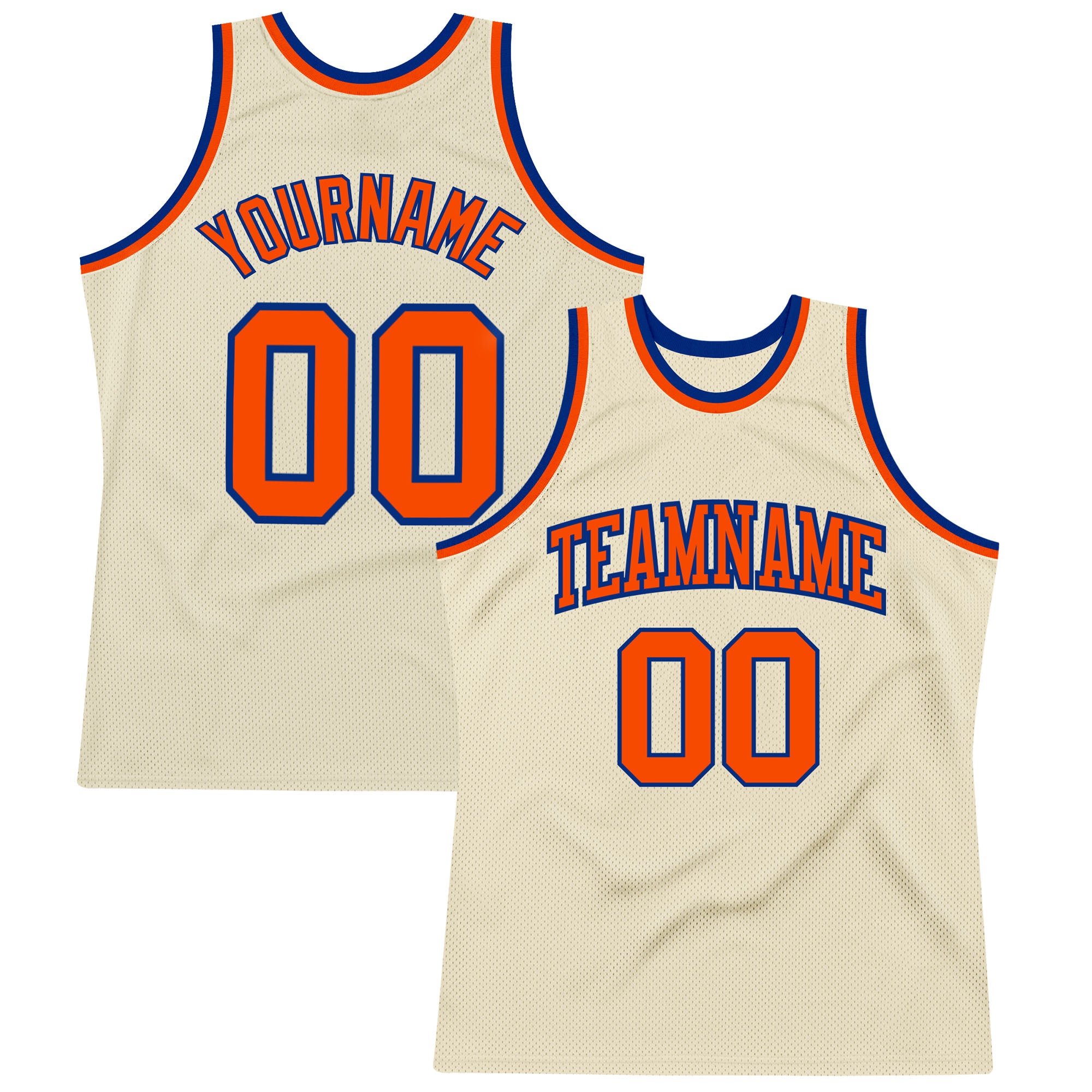
Picking team colors feels like a taste decision. It is mostly a contrast decision. A jersey has one job beyond looking good, which is letting someone identify a player from forty yards away, and a lot of attractive palettes fail badly at that.
Here is what works, what does not, and why.
The rule underneath everything
Readability comes from difference in lightness, not difference in hue. Two colors can be completely different colors and still be almost the same brightness, and when that happens the number stops separating from the body.
A quick test: imagine the design in black and white. If the number and the body would be a similar shade of gray, the combination will read badly from distance no matter how good it looks up close.
This is why a dark outline around a number rescues almost any pairing. It manufactures the lightness difference that the two main colors do not have.
Combinations that consistently work
Navy and white
The safest pairing in team sport. Maximum lightness contrast, reads at any distance, and navy photographs as a true dark under floodlights where black tends to flatten into a shape with no detail. It also hides field marks nearly as well as black does.
Black and gold
Very high contrast and a genuinely distinctive look. Old gold works better than a bright metallic yellow, because bright yellow can vibrate against black at distance. This is one of the most searched combinations for a reason.
Royal and white
Royal blue holds its color under floodlights instead of going muddy, which is exactly why it became the standard team blue. With white numbers it is about as legible as it gets.
Red and white
Strong, simple, and readable. Red is a mid-lightness color, so it needs white or a very light gray rather than gold or orange next to it.
Cream and navy or cream and maroon
The throwback-leaning option. Cream reads warmer than white on camera and pairs well with any deep color. It is also more forgiving of field dust than optical white.
Purple and gold
Uncommon enough that a team in it stands out, and the lightness gap between the two is wide. Purple holds its tone under lights better than most people expect.
Three combinations that fail
Red on black
They look powerful on a screen and disappear on a field. Both are dark, so the number has almost no lightness separation from the body. From the stands it becomes a dark shape. If you want this look, the number needs a white or light gray outline, not a red one.
Navy on black
Same problem, worse. Under stadium lights these two are nearly indistinguishable. It can work as a subtle detail on a sleeve, but never for numbering.
Yellow on white
Yellow is one of the lightest colors there is, so on white it has nowhere to go. In bright sun it vanishes entirely. Yellow needs a dark ground, not a light one.
The three-color rule
Two colors plus a neutral is the sweet spot. Once you are past three, the design starts competing with the number for attention, and the number loses.
A structure that works almost every time:
- Primary: the body color, and the one people will describe your team by.
- Secondary: the numbers and lettering, chosen for maximum lightness contrast against the primary.
- Accent: trim, outline, collar and cuffs only. Small doses.
The accent color is where you can afford to be adventurous, because it never has to carry legibility.
Home and away, without buying two designs
The traditional approach is a light home kit and a dark away kit. You do not need two separate designs for that. Take one design and invert the primary and secondary: navy body with white numbers becomes white body with navy numbers.
The result reads as the same team, which is the point, and it means one design decision covers both sets.
Colors that behave badly on camera
A few practical notes, since most game photos now end up on a phone screen:
- Neon green and neon orange can clip on camera sensors, blowing out into a flat shape with no detail. Great for visibility, harder for photos.
- Pure black loses all texture in bright sun. Navy or charcoal photographs better while reading as dark.
- Optical white blows out in direct sunlight. Cream holds more detail.
- Kelly green separates from grass much better than forest or hunter green, which tend to sink into the field.
Frequently asked questions
What is the most readable jersey color combination? Navy with white numbering, or black with white or old gold. All three have a wide lightness gap, which is what makes a number readable at distance, and all three hold their color under floodlights.
Can I use red numbers on a black jersey? Only with a light outline. Red and black are close in lightness, so without a white or light gray outline the numbers will not separate from the body at any real distance.
How many colors should a team kit use? Two plus a neutral. Beyond three, the design starts to compete with the numbering, and legibility is the thing you cannot trade away.
Do the colors on screen match the finished jersey? Very closely, because the design is dyed into the fabric from the same color file every time. Screen calibration varies, so a color can look slightly different on your monitor than on the garment, but every piece in one order will match the others exactly.
Which color hides dirt best? Black and navy, followed by gray. White and cream show field marks fastest, which is worth weighing if the kit is played in twice a week rather than worn to watch games.
Try a palette
Every design here is made to order, so the colorway you pick is the one that gets printed. Browse custom baseball jerseys, football jerseys, basketball jerseys, soccer jerseys, or the custom jerseys hub. For the numerals themselves, see the jersey number fonts guide.