

Blog
Jersey Number Fonts: How to Pick Lettering Your Team Won’t Regret

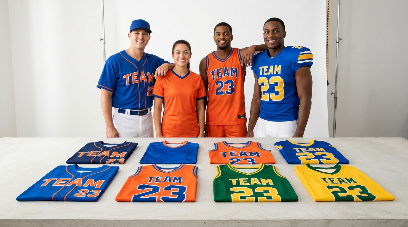
Numbers are the most-read text on any uniform — from the bleachers, from the scorer’s table, from the ref making a call. Picking the right jersey number fonts is the difference between a kit that looks pro and one that looks like a rec-league afterthought. Here is how to choose lettering your team won’t regret.
The 5 Main Jersey Font Families
- Block — thick, squared, maximum legibility. The default of football and basketball; safest choice at every level.
- Varsity / Collegiate — block with serifs or a contrasting outline. Classic school-team energy; pairs perfectly with varsity jackets.
- Script — flowing, retro, best on baseball chest wordmarks. Use for the team name, rarely for numbers.
- Italic / Speed — slanted, aggressive, motion-suggesting. Popular in hockey and esports-style kits.
- Retro / Throwback — rounded seventies shapes and split letters. Big personality; see how they land on throwback basketball jerseys.
Readability Rules That Outrank Style
- Contrast beats everything. Number color must contrast hard with the jersey body — add an outline or drop shadow when the fill is close to the base color.
- Back numbers: 8–10 inches tall. Front numbers: 4–6 inches. Smaller than that disappears at distance; most leagues codify these minimums.
- Avoid ultra-thin strokes. They vanish under stadium light and in photos.
- One font for numbers, one for names. Mixing three typefaces on one jersey is the fastest way to look amateur.
Conventions by Sport
- Baseball: script or varsity wordmark on the chest, block numbers back and front-left — the classic look across custom baseball jerseys.
- Basketball: big front-and-center numbers, block or italic — legibility drives referee calls.
- Football: block only, with outlines; numbers appear on front, back, and often shoulders.
- Soccer & hockey: large single back number, name arched above; modern kits trend toward custom italic sets.
Matching Font to Identity
Established club with tradition? Varsity. Youth program parents will screenshot? Clean block with a bold outline. Beer-league team with a joke name? Retro script leans into it. The font is part of the brand — pick it once, keep it across jerseys, hoodies, and warm-ups so the whole program matches. When you order through the custom jersey maker, our designers set name and number typography for you and confirm it on the proof, so sizing and spacing come out regulation-ready.
FAQs
What font is used on most sports jerseys? Variations of block lettering dominate because they stay legible at distance; varsity block with an outline is the most common team choice.
How big should jersey numbers be? Roughly 8–10 inches on the back and 4–6 inches on the front — check your league rules, many specify minimums.
Can I use my own font on a custom jersey? Yes — send a font reference or file with your order and the design team will match it or recommend the closest athletic-weight alternative.